Nespresso by De’Longhi Research & Development.
For Nespresso by De’Longhi, we wanted to focus on creating an animation that aligns with their current messaging of coffee craft, origins and freshness. Initially we focused on creating a seamless story from coffee cherry, through to roasting, grinding and sealing of the pod, within one smooth motion allowing an emphasis on freshness and quality. Without breaking the flow, we then moved on to highlight the range of pods, the machine itself and the signature Nespresso coffee, continuing the smooth motion throughout.
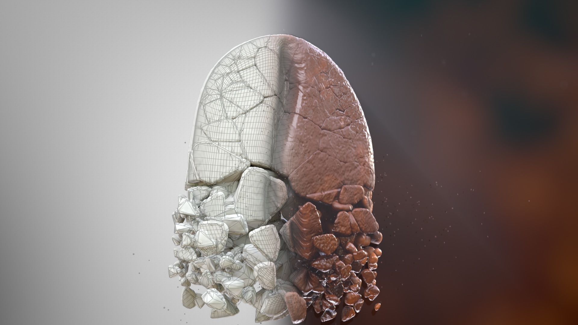
Achieving the continuous smooth motion throughout required a combination of several 3D techniques. The bean itself required multiple processes, to take it from raw bean material, to roasted, to ground. Firstly, animated noise maps were used to blend the raw bean to roasted. A separate animation map is then used to add displacements and additional detail, giving the bean a roasted, puffy look. A process called Voronoi fracture was then used to break the bean into segments in a realistic manner. Utilising C4D fields, these segments could then be pushed apart in a controlled way, from one side of the bean to the other for a natural animation. Finally, a high-density particles simulation was needed to create an interesting flow of coffee grounds into the pod. To achieve this look, X-Particles were used to allow a flow along splines that created the paths. Some randomness and turbulence were also introduced for a more realistic look.

Looking at the machine segment of the animation, the biggest challenge was emulating the Nespresso action using a fluid simulation in real-flow. There were various challenges in getting this right. Making sure that the modelled 3D objects were scaled in real world terms to achieve realistic results. Ensuring the fluid achieved the correct speed when filling the glass, so the shot isn’t too long and slow, but also not so quickly that the jet of fluid creates an unrealistic splash in the bottom of the glass. The fluid must also be viscous enough to be stable and create some surface tension, without looking gooey or thick. Finally, an animated material set up was used to create a realistic blend between the standard coffee material and the crema on top. Which is all achieved using vertex maps.

To ensure the content is as realistic as possible, various lighting, grading and composting techniques were employed to create the different moods expressed throughout. From the sunny exterior in the opening scene, to the dark and moody look created through coffee roasting and grinding – during which volumetric lighting is used to create a dramatic look. Then as we transitioned to the kitchen sequence, we move from a dark scene, through to a fully lit morning scene as the coffee is poured. This allowed us to achieve 2 things, a smooth transition from the moody abstract space the coffee bean existed in as it transitions from branch to pod, but also a suggestion of transition from night to morning, when most choose to enjoy their daily coffee.
Combining this range of 3D techniques throughout the production process, has allowed us to create content which successfully encapsulates the bean to cup story which Nespresso so often pride themselves on. Through the continuous motion, we were also able to highlight the quality of the machine created by De’Longhi for Nespresso. Using this continuous link style, allows the animation to flow effortlessly through the different scenes, allowing the consumer to follow the story with ease.
nik
Share on

